

Q&A With SSU’s Graphic Design Team
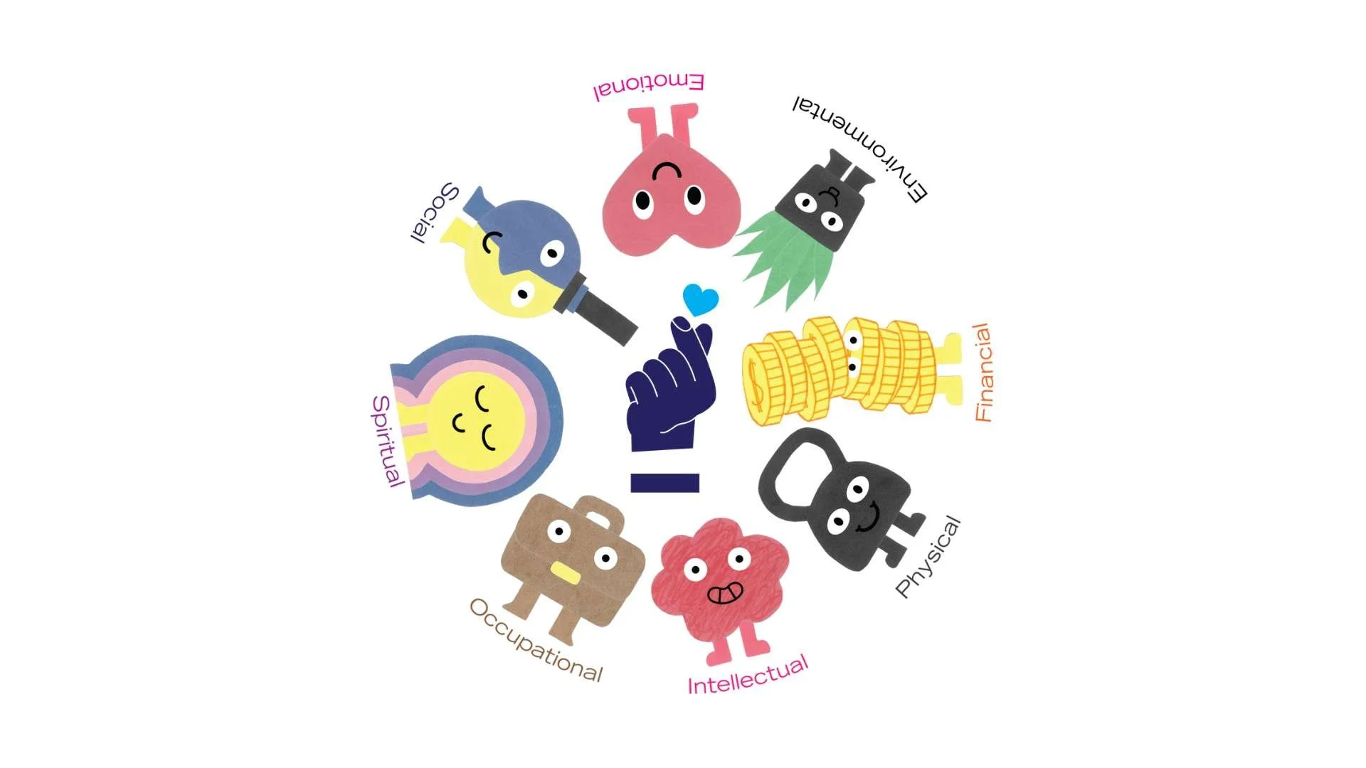
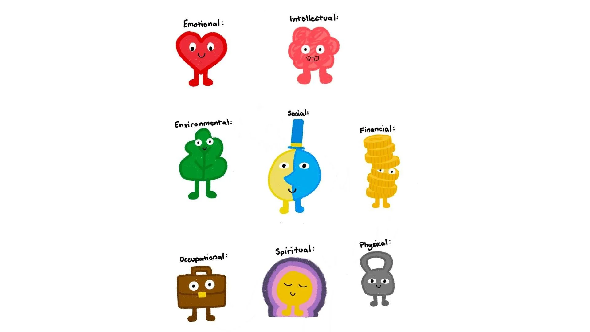
With new icons for Dimensions of Wellness (DOW), we decided to connect with the Graphic Design Team to understand what went into the rebranding of our DOW characters. Take a look at what the Creative Team Manager, Ryan, and our Junior Graphic Designers (JGD), Parris, Dexter, and Jaine, had to say about their creative process behind designing the ‘Little Mx Wellness Characters’!
Meet the Team!
Our Graphic Design team is made up of 3 JGDs. Parris and Jaine are in their final year of the Interaction Design program, and Dexter was in the Illustration program but changed and is now 1st year of Animation. Ryan has been the Creative Team Manager at the SSU for years. Parris has been a JGD for the longest time and helped to spearhead this project.
Q:Whose idea was it to rebrand and why?
A: Ryan decided that it was time to update the visuals and worked with JGD Parris to come up with ideas. The team found inspiration in Andy J Pizza’s ‘Invisible Things’, the works of Jon Klassen & the ‘Mr Men’ series and went from there!
Q:Why were these works such strong Inspirations?
A: The simplicity in designs is great for accessibility and the team wanted to create visuals that were easy to understand to the majority of students, especially since ‘Dimensions of Wellness’ can be a new topic for so many people.
Q: How was the process different for this rebranding?
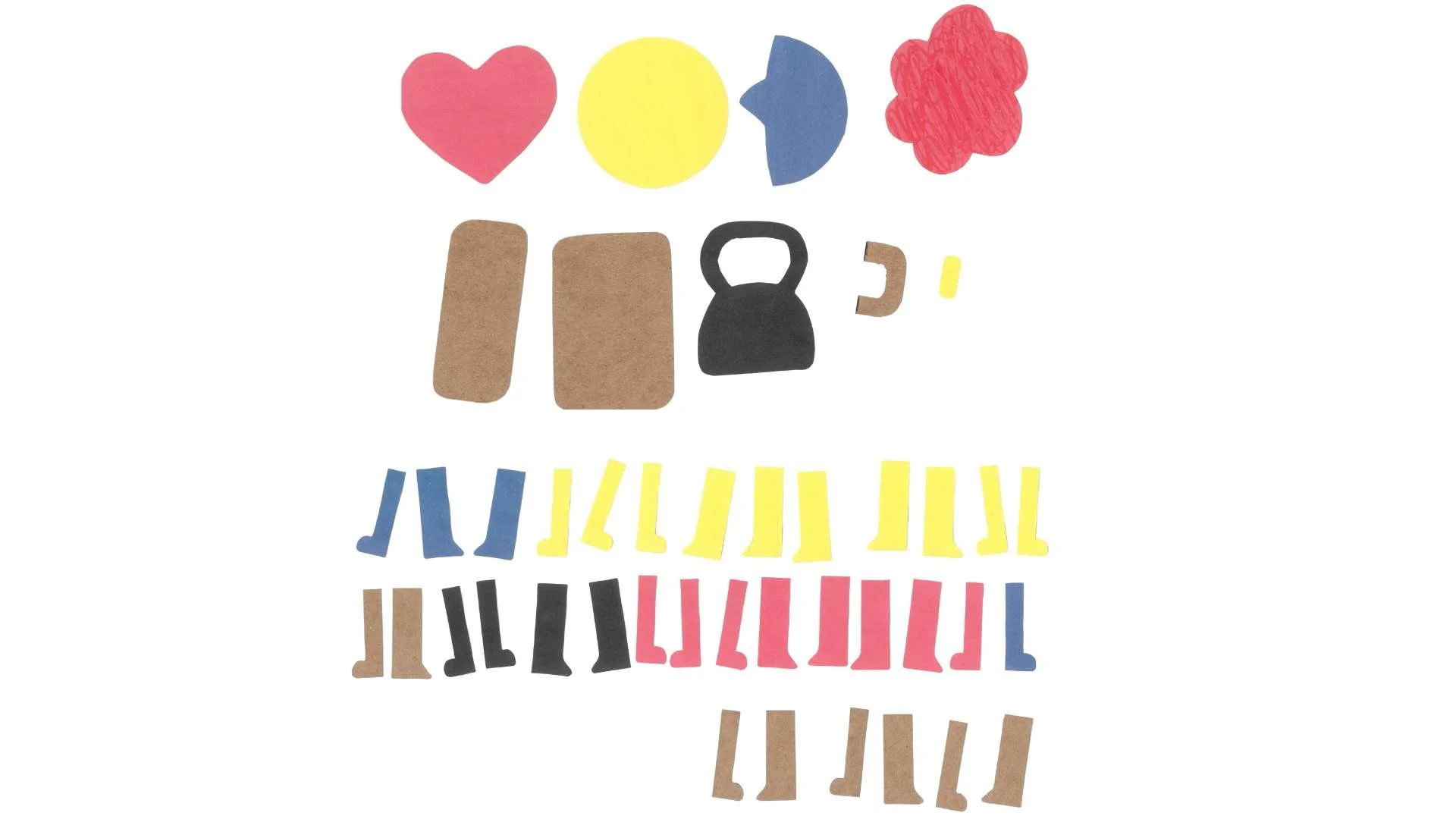
A: Usually, the team does digital renderings of visuals but for this, they wanted the characters (icons) to have cool textural layers and decided to sketch on paper.
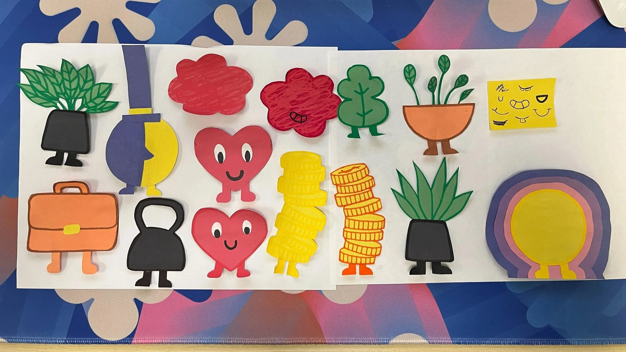
Physical cutouts of the iterations
Q: What is the process of creating visuals?
A: Parris, Dexter and Jaine all follow similar processes, they start with inspiration from Pinterest, make mood boards and look at past or similar designs. After getting their information, they start sketching designs and putting things together.
Q: What was it like to work on paper?
A: The JGDs cut out each piece of the characters on different coloured paper. After this, they scanned all the pieces and started assembling icons digitally. If you look closely, you can see the authentic paper texture!
Q: How long was the process from conception to completion?
A: It’s important to keep in mind that the JGDs only work part time and had to balance creating total new icons while balancing all their other work. In total, they worked between, roughly, 40 & 60 hours to develop our new DOW visuals!
Q: What are some lessons learned from this process? (quotes)
A: The 3 main things the team learned were:
1. How to take abstract ideas and represent them in a visually pleasing way.
2. Icon design on physical material takes a lot of time.
3. It can be challenging to come up with original ideas, which is why research is import to help you get on the right track!
Q: Which characters are the team’s favourites and why?
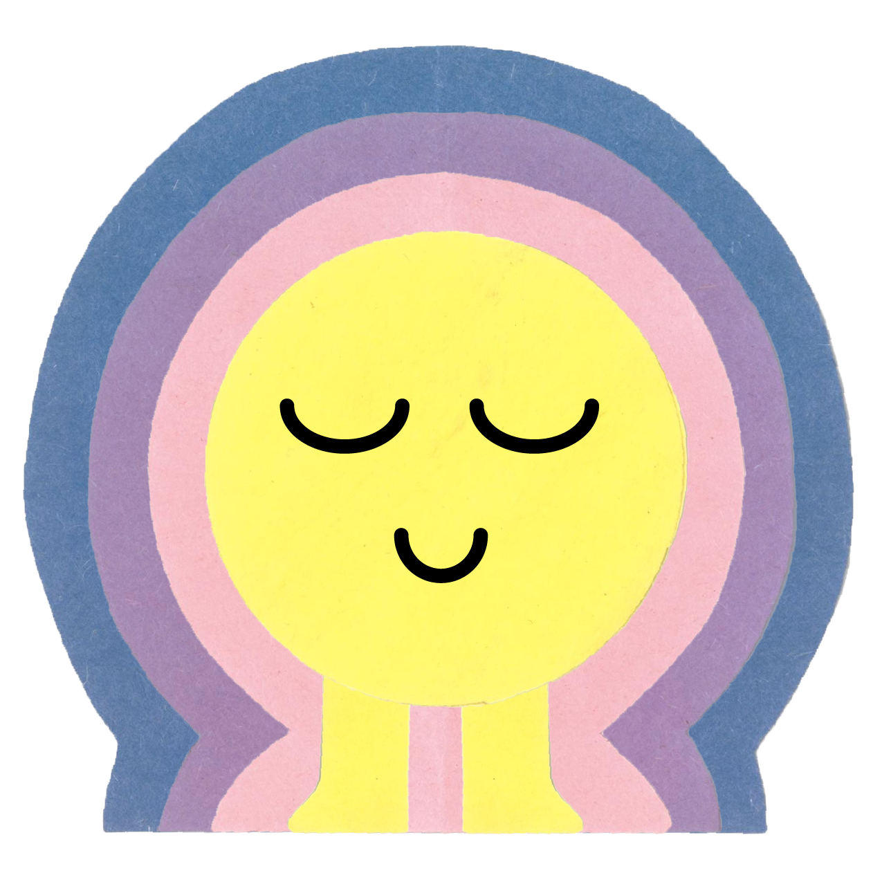
Jaine: Spiritual
The colours and shapes of the spiritual wellness character are Jaine’s favourite. She enjoys how dreamy and pretty the icon is.
Ryan: Financial
Ryan loves the shape of the financial wellness icon!
Dexter: Financial
Dexter loves the fun shape of the financial wellness character!
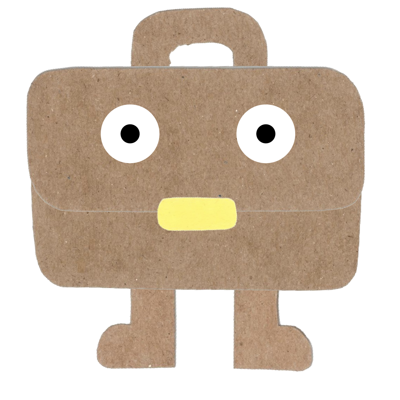
Parris: Financial and Occupational
Parris likes the details in these characters, specifically, the mouths being coins and a buckle.

Looking for more wellness and creative guides? Check these out:
Find thrifting tips, creative outlets and personal reflections. Explore some of our latest blog entries:

From the longest freshwater beach in the world at Wasaga Beach, to the crystal-clear turquoise caves of Tobermory, to the storybook gorge town of Elora — these 5 destinations are fun, budget-friendly, and genuinely worth the drive. No passport needed. 🚗☀️